 The chart node is used to display input data in various chart forms.(line, pie, bar etc).
The input data is usually time based but doesn’t need to be.
The input data can be real time or inserted from a database or log file
Displaying Real Time Data
This is relatively easy to do and is the default behaviour meaning that there is virtually no configuration to do.
You use the msg.payload to pass the data to the chart as a number and the msg.topic property to pass in the data series name.
You can display multiple lines on the same chart.
There is no need to pass in a time stamp as this is taken from the input message time. However you can specify a time stamp using the millisecond past the epoch format which you get using:
let d= new Date();
let timestamp=d.getTime();
So use:
{topic:"temperature", payload:22}or
{topic:"temperature", payload:22, timestamp:1520527095000}For multiple time series use a msg object of the form:
{topic:"temperature", payload:22}
{topic:"humidity", payload:66}
You can use the colour selection boxes to set the colour of the line chart for each data series.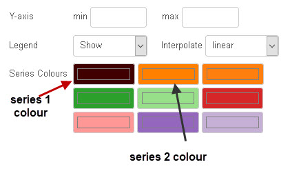
Usually there is no need to set the max/min as it will be set dynamically based on the incoming data. Use the show legend to display the series name contained in the topic property on the graph.
The x axis label format can be changed in the configuration node, but I haven’t found a way of adding a label to the Y axis.
This video shows you how to display real time data and uses simple inject nodes to create the data.
Displaying Bar Charts
Besides the line char bar charts are another common format
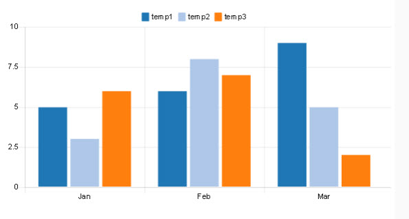
You can see in the example above that the x axis contains the month names passed in the msg.label property.
The actual data is shown below:
msg.payload=[{
    "series": ["temp1", "temp2", "temp3" ],
    "data": [ [5,6,9], [3,8,5], [6,7,2] ],
    "labels": [ "Jan", "Feb", "Mar" ]
}];
You should notice that the payload is an array containing an array of of three objects-series, data and labels. All objects contain an array.
The data object is an array of arrays. If you look at the data in the first array [5,6,9] 5 is for Jan,6 is Feb and 9 is March. The bar chart for the data is shown above. Notice how it corresponds to the to the series labels.
The first array [5,6, 9] is the data for the series named temp1.
Displaying Time Related Stored Data
Displaying time related stored data is a little more tricky than real time data as you need to get the stored data into the correct form which is an array of objects.
The graph below shows 3 plots called A, B and C
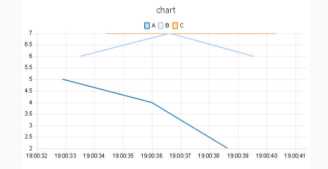
The data that generates the above plot is show below:
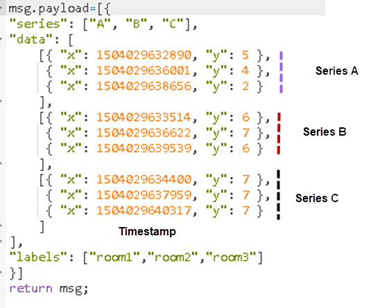
Again we have 3 data plots (A,B,C) and even though we add labels they aren’t used. Each data plot has three values contained in a object e.g.
{“x”: 1504029640317, “y”: 7 }
The x property contains the unix type time stamp (in ms) and the y property contains the value at that time.
Here is a video that covers the above.
Creating a Chart from as CSV file
Arising from my chart videos I had a question from a viewer that had data stored in a csv file and needed to display it on a chart.
The chart looks like the one below:
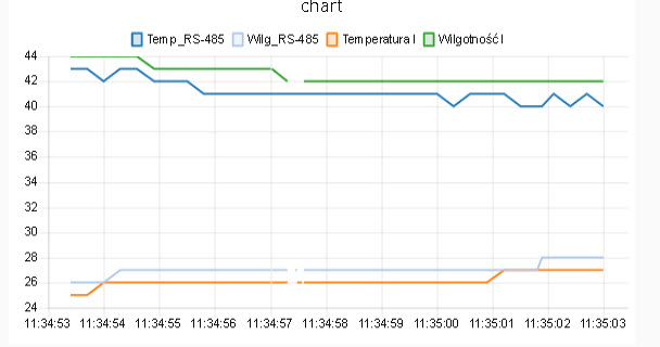
I created a video describing the process- Creating a Chart from A CSV File In Node-Red
Flows used in videos and csv file
Creating a Chart from JSON Data
Another common format for storing data is JSON and You can see how to read JSON data files and create a chart in the above video starting at 5:36.
Flow used in video
Quick Review questions
Answers at the end
Q1 -If in the bar chart example we were to plot for 6 months from Jan to June what would the data field look like
- “data”: [ [5,6,9], [3,8,5], [6,7,2],[2,7,2] ,[5,7,1] ,[5,8,2]],
- “data”: [ [1,3,5,5,6,9], [1,2,3,3,8,5], [2,4,6,6,7,2] ],
Q2 -If in the stored time series example we were to plot for 40 data points for each data series (A,B,C) how long would each array be.
- 3
- 120
- 40
Resources
Chart node documentation on github with examples
RelatedTutorials
- Using the UI Dashboard Template Node (Widget)
- Using the Node-Red Template Node
- Using the Node Red Status Node
Answers
Q1=1 and Q2 =3


I’m new to node-red. I’ve done the default installation, and there is no node named “chart”. When I look at the options under install in manage palette, there are lots of different chart options that could be installed. Which is the “right” one to match up with this tutorial?
Hi
You need to install the dashboard nodes as they aren’t part of the default install
https://stevesnoderedguide.com/node-red-dashboard
rgds
steve
Hello Steve
Thank you for your explanations on the chart node. I am trying to get an easy zoom function on that node and my last idea is to get an x&y values out from a click on the dataset. Would you have any suggestion on how to do that?
Thank you very much
Damien
Where would you click?On the chart to expand it at that point?
rgds
steve
Hello Steve,
Thank you for this good overview.
I use Chart Nodes in my project, among other things, to display values over a longer period of time. Unfortunately, however, the historical values are lost every time Node Red is restarted.
Is there a solution for this?
Thanks a lot!
Harald
Hi
You need to log the data to a database or file and then display them from the file/database. I do have a working flow that does this if you want it then use the ask steve page and I will email it to you.
I thought I had already done a video on it but I couldn’t find it.
Rgds
Steve
Dear Steve,
I got the same situation, can you email it for me too?
Sorry what problem is that?
Rgds
Steve
Hi Steve,
I am reading a Modbus value with the Modbus-read node and display it with ui_text node.
When I connect it to a chart node no value is displayed on the chart.
Here is the value from the modbus read
{“topic”:”polling”,”payload”:[114],”responseBuffer”:{“data”:[114],”buffer”:[0,114]},”input”:{“topic”:”polling”,”from”:””,”payload”:{“unitid”:”1″,”fc”:3,”address”:”1448″,”quantity”:”1″,”messageId”:”628e8ea5352776e2a377141a”},”queueLengthByUnitId”:{“unitId”:1,”queueLength”:24},”queueUnitId”:1,”unitId”:1},”sendingNodeId”:”c1bd5243afcc0f45″,”_msgid”:”59d04441a07b055b”}
How to display on a chart the payload?
All the chart needs is a payload and topic. Are you sending in a topic?
Rgds
Steve
I added a function node before the chart node
msg.payload=Number(msg.payload)
return msg;
And now there is data on the chart.
Thanks for creating this resource of information.
I am a noob on node-red and am still trying to figure how to post 3 temperatures in one line chart.
I connected 3 mqtt inputs to the chart, room/temperature, room/temperature1, room/temperature2
But the chart only listens for one group on the first set-up page of the chart.
oddly, when I hold my cursor over a data point, I see the 3 inputs, but they all use one input (payload?), so there is only one line.
Any suggestions ?
You need to have a separate topic for each value.So make sure you are sending the correct topic.
Does that make sense?
Rgds
Steve
Thanks for all your hard work. You helped me a lot
Hi Steve,
Thanks for all your work.
I might have missed it, but ‘where’ do you go to view the graphs? I will have NR running in Docker and the admin obviously in a browser tab. Presumably the graphs are on a different, configurable port?
A further question: Can I have different graphs visible on different tabs (ports)?
it is on the url /ui
so
localhost:1880/ui
rgds
steve
Thanks for the overview….
What I’m still missing is how to force the colours to a specific value based on the topic.
All the examples to set colour pass multiple series in one msg.
My use case has multiple independent msg arriving at the chart, and the colour is defined by whatever topic arrived first. So if I restart node-red, the colours rotate according to msg flow. Not good.
Still looking for a solution 🙁
You are correct as it doesn’t let you select the colour using a msg attribute. However you can set the colours by setting them to 0 with the topics in the order you want. the flow below sets the humidity as the first colour. To change it just reverse the order in the reset node.
//
[{“id”:”67b85ab8.fa56dc”,”type”:”tab”,”label”:”Flow 4″,”disabled”:false,”info”:””},{“id”:”a231807.c4cd6″,”type”:”inject”,”z”:”67b85ab8.fa56dc”,”name”:””,”props”:[{“p”:”payload”},{“p”:”topic”,”vt”:”str”}],”repeat”:””,”crontab”:””,”once”:false,”onceDelay”:0.1,”topic”:”temp”,”payload”:”1″,”payloadType”:”num”,”x”:110.26666259765625,”y”:107,”wires”:[[“72d04710.f9b918”]]},{“id”:”d710977d.b10328″,”type”:”ui_chart”,”z”:”67b85ab8.fa56dc”,”name”:””,”group”:”c4bc94f0.ab5e18″,”order”:3,”width”:”0″,”height”:”0″,”label”:”chart”,”chartType”:”line”,”legend”:”false”,”xformat”:”HH:mm:ss”,”interpolate”:”linear”,”nodata”:””,”dot”:false,”ymin”:”0″,”ymax”:”20″,”removeOlder”:1,”removeOlderPoints”:””,”removeOlderUnit”:”3600″,”cutout”:0,”useOneColor”:false,”useUTC”:false,”colors”:[“#ff0000″,”#aec7e8″,”#ff7f0e”,”#2ca02c”,”#98df8a”,”#d62728″,”#ff9896″,”#9467bd”,”#c5b0d5″],”useOldStyle”:false,”outputs”:1,”x”:466.2666320800781,”y”:70.25,”wires”:[[]]},{“id”:”92ce1e62.74bd38″,”type”:”inject”,”z”:”67b85ab8.fa56dc”,”name”:””,”props”:[{“p”:”payload”},{“p”:”topic”,”vt”:”str”}],”repeat”:””,”crontab”:””,”once”:false,”onceDelay”:0.1,”topic”:”humidity”,”payload”:”1″,”payloadType”:”num”,”x”:115.88333129882812,”y”:226.88333129882812,”wires”:[[“72d04710.f9b918”]]},{“id”:”72d04710.f9b918″,”type”:”function”,”z”:”67b85ab8.fa56dc”,”name”:””,”func”:”var count=context.get(\”count\”) || {};\nif (typeof count.temp==\”undefined\”)\n{\ncount.temp=0;\ncount.humidity=0;\n}\nif (msg.topic==\”temp\”)\n{\n count.temp+=1;\n msg.payload=count.temp;\n msg.color=\”green\”;\n}\nelse\n{\ncount.humidity+=1;\nmsg.payload=count.humidity;\nmsg.color=\”red\”;\n}\ncontext.set(\”count\”,count);\nreturn msg;”,”outputs”:1,”noerr”:0,”initialize”:””,”finalize”:””,”x”:253.26666259765625,”y”:149.06666564941406,”wires”:[[“d710977d.b10328″,”b26f3700.25e698”]]},{“id”:”b26f3700.25e698″,”type”:”debug”,”z”:”67b85ab8.fa56dc”,”name”:””,”active”:true,”tosidebar”:true,”console”:false,”tostatus”:false,”complete”:”false”,”statusVal”:””,”statusType”:”auto”,”x”:475.2666320800781,”y”:171.71665954589844,”wires”:[]},{“id”:”6932b805.a66ae”,”type”:”inject”,”z”:”67b85ab8.fa56dc”,”name”:””,”props”:[{“p”:”payload”},{“p”:”topic”,”vt”:”str”}],”repeat”:””,”crontab”:””,”once”:false,”onceDelay”:0.1,”topic”:””,”payload”:””,”payloadType”:”date”,”x”:81.26666259765625,”y”:30.48333740234375,”wires”:[[“67b2aa4f.a7bf8c”]]},{“id”:”67b2aa4f.a7bf8c”,”type”:”function”,”z”:”67b85ab8.fa56dc”,”name”:”reset”,”func”:”msg.topic=\”humidity\”;\nmsg.payload=[];\nnode.send(msg);\nmsg.payload=0;\nnode.send(msg);\nmsg.topic=\”temp\”;\nnode.send(msg);”,”outputs”:1,”noerr”:0,”initialize”:””,”finalize”:””,”x”:246.26666259765625,”y”:34.46665954589844,”wires”:[[“d710977d.b10328″,”b26f3700.25e698”]]},{“id”:”c4bc94f0.ab5e18″,”type”:”ui_group”,”name”:”Demo”,”tab”:”20694037.51f098″,”order”:2,”disp”:true,”width”:”6″,”collapse”:false},{“id”:”20694037.51f098″,”type”:”ui_tab”,”name”:”Home”,”icon”:”dashboard”}]
//